Lantern press:
drinkwares+Bookmarks
PROJECT:
As an in-house Production Designer at Lantern Press, I specialized in adapting our original 2:3 artwork for a variety of product formats, including drinkware and bookmarks. Working from illustrations created by our in-house artists, I transformed artwork into production-ready layouts for mugs, tumblers, shot glasses, and bookmarks, each with its own unique dieline requirements.
The role required balancing technical production constraints with the integrity of the original artwork. Challenges varied depending on the editability of the files, as some legacy pieces were flattened while others relied heavily on vertical compositions and visual storytelling. Drinkware often required adapting vertically oriented artwork to wide horizontal dielines, while bookmarks presented the opposite challenge, requiring artwork to be reformatted for an extremely narrow vertical space. In both cases, I carefully reworked layouts, repositioned elements, and adjusted compositions to preserve the original narrative, visual balance, and overall impact while ensuring each design fit its final product format.
POSITION: Production Designer
TEAM: Production Design Team at Lantern Press
KEY SKILLS UTILIZED:
-
Adobe Illustrator/Photoshop
-
Branding
-
Typography
-
Reformatting
-
Dieline
drinkwares
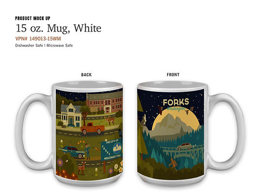
This artwork was created for Forks, Washington, inspired by the Twilight movie series set in the area. It serves as a strong example of a vertical-focused artwork composition that required adaptation to fit the horizontal dieline for the 15 oz mug.


%20Metro%20Mug-LPMockup.jpg)
%20Metro%20Mug-2016.jpg)

This typography-driven artwork presented a unique set of challenges. Elements had to be carefully rearranged to fill the dieline while preserving the spacing, balance, and overall feel of the original 2:3 composition.
%20Metro%20Mug-LPMockup.jpg)
%20Metro%20Mug-2016%20.jpg)

bookmarks
There are 3 bookmarks I would design, paper, metal, and wood. I evaluate how the composition will translate into a narrow vertical format. From there, I relayout and reposition key visual elements to maintain balance, hierarchy, and storytelling within the limited space of a bookmark dieline.
The goal is to adapt the artwork in a way that respects both the original illustration and the functional constraints of each material, ensuring clarity, durability, and visually able to view on a small size product.


